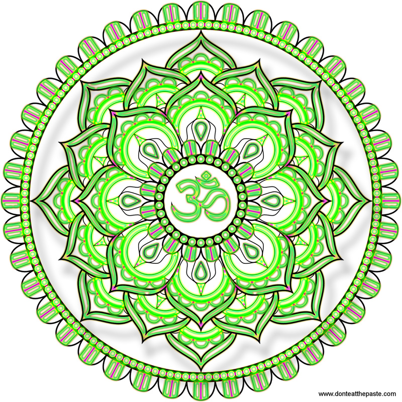
This is my least favorite mandala as I don't like the vivid green. What was interesting about the styles used was that they were all patterns. I love the outline of the mandala, but don't like how the vivid color responds with the outline. I also feel that with all the colors and patterns that it is competing with itself, which in turn limits its appealing factors.
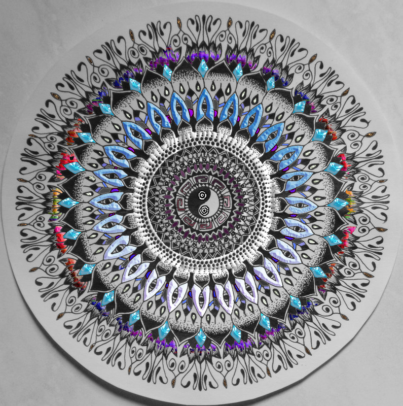
This is the mandala that i like. I love how it revolves around the yin yang in the center. I also really like how the patterns add and play into the other colors. I used a style for the lotus flowers which made me incorporate a purple into the inner parts of the design. The feathers play back into the patterns by incorporating blue values found throughout and mixes back in with purple. On the feathers I also inserted a grey color to match it back to the background and the darkness of the initial background. I added a white/grey style before the feathers in order to introduce more light tones to the mandala and balance out the darker tones.
